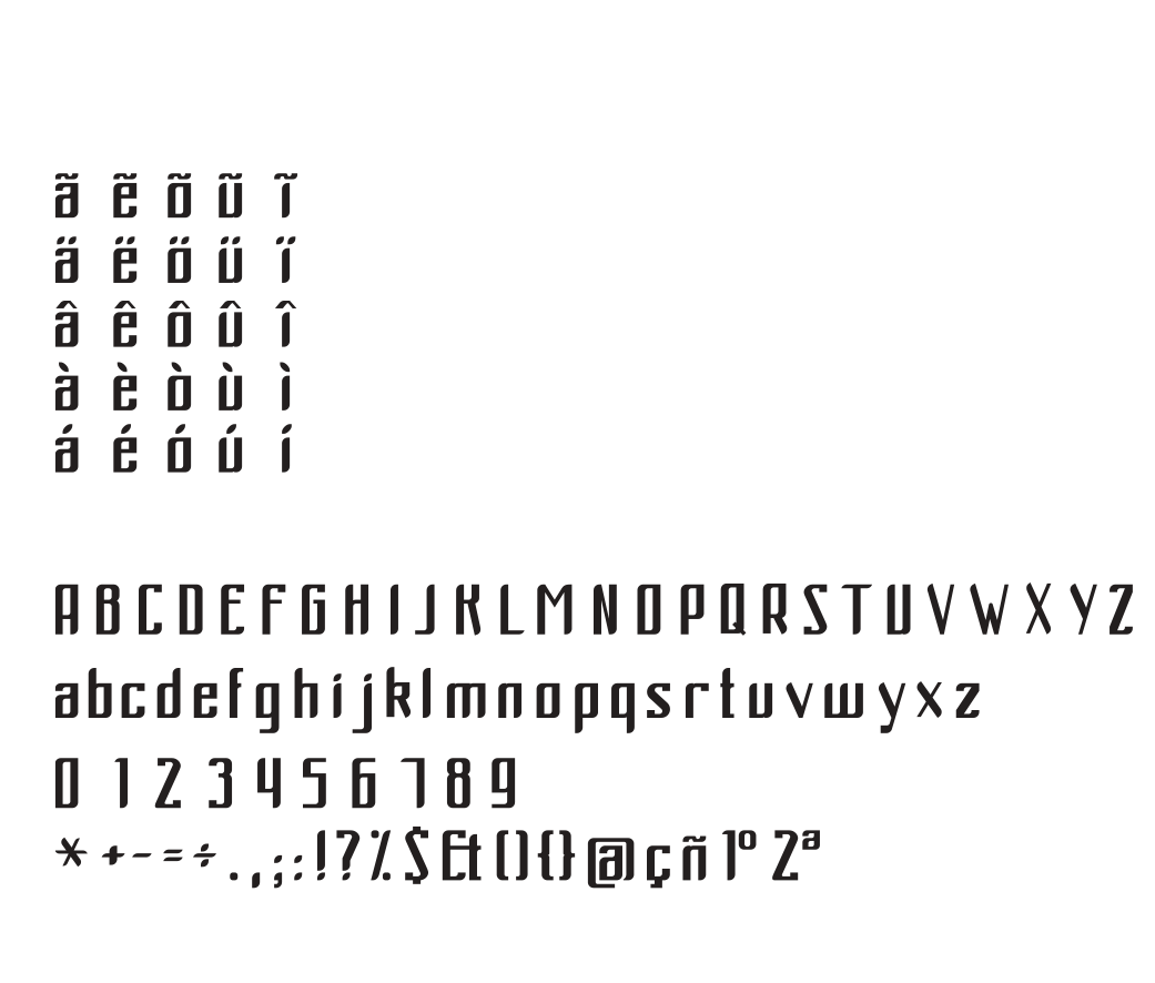
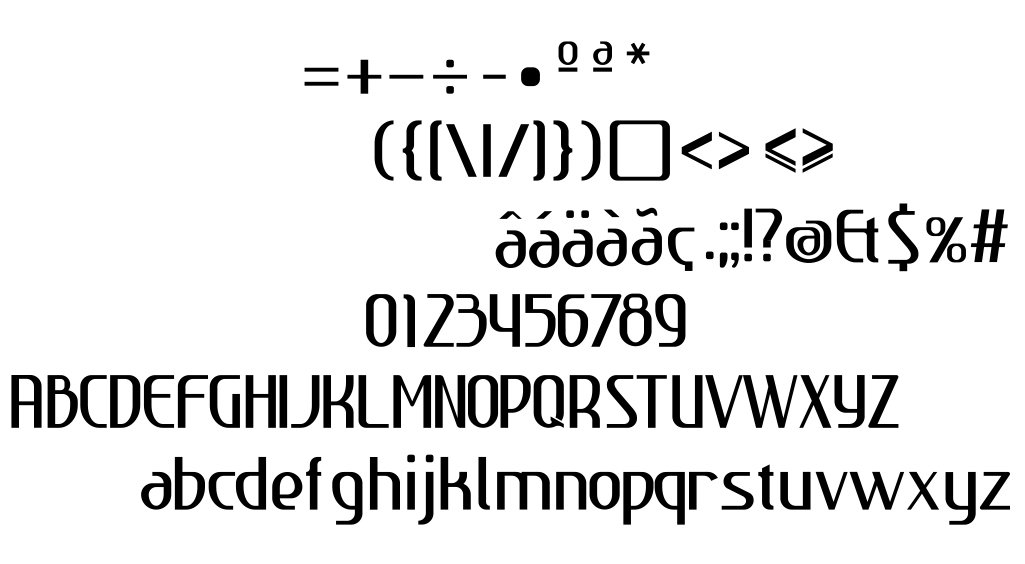

One of my most complete and functional typographic projects, July9 was created under a simple 4x5 construction system and medium contrast defined by the thickness variation from 1 module to 0.5 module. Beyond being a homage to the important Civil Revolution in São Paulo, its name also refers to the hospital of the same name, the place where it was created.



Elliptic was my first typographic project. The display font, already used by several other designers in logos and editorial decorations, has as its design principle the letter o, lower case, for obvious reasons. Since the first 6B pencil sketch, drawing has always been closely linked to the strength of elliptical shapes. It may be the most important piece of modular font design included in my portfolio.

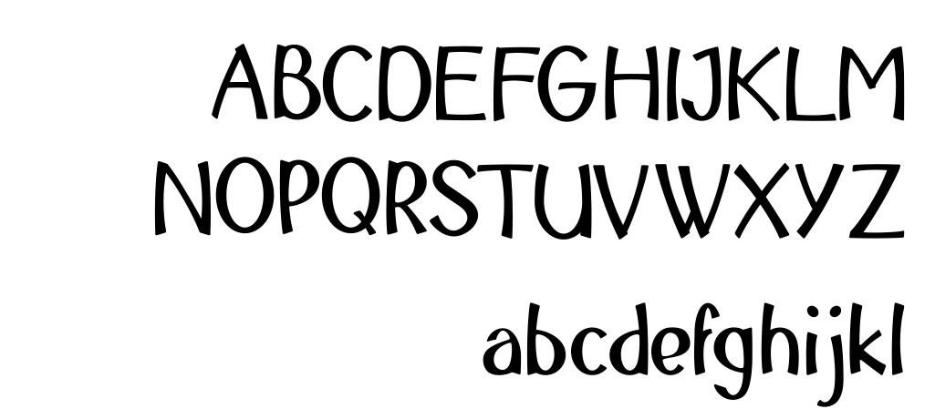
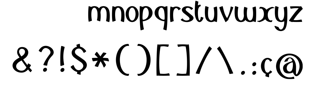
Ipsum alphabet was created in 2007 and has undergone constant updates since then. Under a 4x5 construction system and contrast defined by the thickness variation from 1 module to 0.5 module, the fact that it has no straight rods, arched edges and rounded corners means that the letters do not need optical adjustments in their designs.

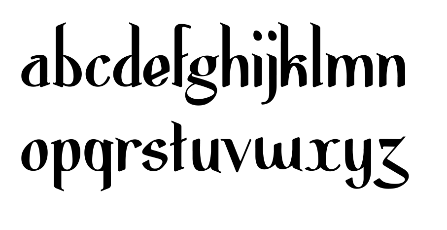
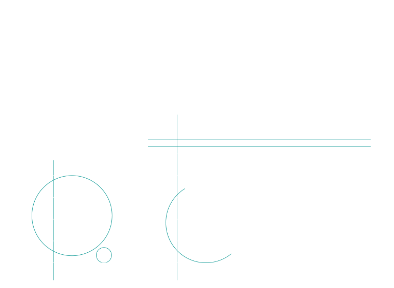




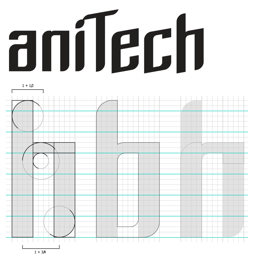
Developed in the early 2000's, this is one of the few experimental modular display font projects, and its construction system is based on the 3.5x4 ratio.
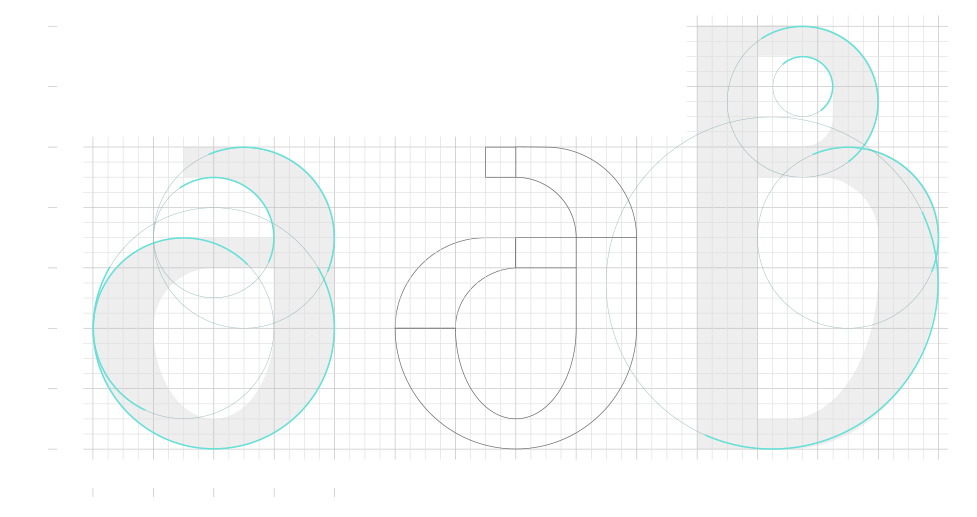
Cupuaçu was inspired by an image of the fruit of the same name that suggested the counter ofthe letter a, character that gave rise to the entire alphabet. Its visual language has a strong digital appeal and the apparent lack of pattern is actually one of the main characteristics of its construction pattern.
Developed in the early 2000's, this is one of the few experimental modular display font projects, and its construction system is based on the 3.5x4 ratio.
Cupuaçu was inspired by an image of the fruit of the same name that suggested the counter ofthe letter a, character that gave rise to the entire alphabet. Its visual language has a strong digital appeal and the apparent lack of pattern is actually one of the main characteristics of its construction pattern.